
Welcome to the C&P Preflight Checklists. Be sure to read all the information on this page before placing your order. In order to ensure that you fully understand the printing process, please click "Got it" after each section.
A. Shift/Borders/Alignment 

Your image may shift between prints. You can edit your artwork to ensure the best final result possible
When a blade comes down through a stack of prints for final trimming, there is a slight unavoidable shift that occurs. This is true in all print shops and the acceptable industry standard is ⅛” shift. The shift might appear from top to bottom, right to left, or as a very slight skew, and it can affect how your artwork looks. Rest assured that we minimize this shift as much as possible. What can you do to help?
-
Edit or remove design elements that can draw the eye to the shift.
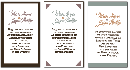
If frames around the edges of a design are important to your design, we recommend that you make them as thick as possible- at least ¼” thick inside the cutline. This ¼” thickness is in addition to the bleed allowance of ⅛” outside the cutline.
If borders, thin lines or artwork run parallel to (but not touching) the file edges, we recommend that you move them in and away from the cutline by at least ¼” For visually acceptable results, pieces with frames or borders must be over 2”
NOTE: These adjustments will improve the appearance of final prints by visually balancing the shift. They do not impact the actual cutting process. -
Keep important content away from the cutline!
Any artwork or text that is designed too close to the cut line is at risk of being trimmed. Please be sure that you keep a safety margin of at least 1/8” between your critical content and the cut line in your design. Please see “B2” for a better understanding of where the cut line is. -
Make sure your design elements are even.
The cutting shift may highlight any elements that are uneven in your design. For example, when frames are designed with varying thickness on each edge, the thicker edges might look considerably more thick (and thinner edges considerably more thin) on final prints. This applies to alignment of text and graphics as well. -
There are special considerations for folded pieces.
Please see the separate preflight checklist for scored prints if this applies to you.

B. Full Bleeds/Safety Margins
You may or may not need a full bleed. You always need a safety margin.
-
Full Bleeds
Does your printing need to touch the edges of your final prints?
It is not possible to print right to the edges of a piece of paper, but the look can be achieve by using a “bleed.” Full bleed means that extra space is built in around the edges of your file, and your artwork needs extend to the edges of this added space. The extra space is then intentionally trimmed off, giving the appearance that the ink was printed to the edges of the paper. You can stretch your artwork to fit a larger file size to accommodate a bleed, but just be aware that you will lose the outer edges of your design if you do this. A more desirable option is to extend certain graphics or background colors while not moving critical content.File Set -up Example
For full bleed printing, a 1/8” bleed allowance is needed on all 4 file edges. As an example, a 3.5x5” RSVP card needs a file that is exactly 3.75x5.25” with the artwork extended to the file edges
(0.125” + 0.125” = 0.25” total extra added to both the height and width).
*Any critical graphics or text should be kept 1/4” away from the file edges (this is 1/8” away from the cut line). -
Safety Margins
Make sure your content is safe!
Whether your design requires a full bleed or not, your file needs to have a safety margin to protect your important text and artwork. If your file does NOT have a full bleed, then the edge of the file is the cut line. If your file DOES have a full bleed, then the edge of the file is NOT the cut line. Either way, keep any text or graphics that you care about at least 1/8” away from the cut line.File Set -up Example
For a 3.5x5” RSVP card that does not require a full bleed, the file should be exactly 3.5x5”. All file content should be kept 1/8” away from the file edges.
 (2 of 8) | Got it! What's Next?
C. Colors 
Color can be unpredictable. Make sure you know what to expect!
Colors in any given file will vary slightly in print result from printer to printer, from print run to print run, and from paper to paper. Colors will never print to look exactly like the colors that you see on various computer monitors. Even if you test-print your files at home, results are likely to be different than ours. For these reasons, it is always critical to proof your files on the printer that you plan to use for your final prints. Also please keep in mind that colors will print out darker on translucent vellum paper.
-
Know your color profile- and use CMYK if you can.
Paper, print, and monitor displays all use different kinds of color profiles. C&P Uses a high quality CMYK digital press. This means that any color profile that you use to create your files will be translated into CMYK as part of the printing process. Mixing color profiles within a file (for example, graphics that have been designed in RGB and fonts that are designed in CMYK) may have unpredictable results in print. Proofs are critical if you want to see how your file colors will print! -
C&P CMYK codes are suggestions for a close, coordinating print color.
The CMYK codes suggested on our website have been carefully created to closely coordinate with C&P's papers, but please be aware that the codes will not provide an exact match. For example, since CMYK does not have a “white” component, pastels are limited to how much “black” (“K”) can be removed from the color. This makes it very difficult to color match light colors like turquoise. -
Print results always vary slightly.
When a proof is ordered through our Print Shop, we do our best to ensure that final prints match the proof as closely as possible. However, please be aware that there may be a slight variance even between a proof and a final order. We only ship final prints that are within an acceptable industry variance for color.
Printing color ink on color paper: We strongly recommend ordering a proof before printing CMYK colors on colored paper to ensure you are 100% satisfied with the results. The ink will absorb some of the paper's pigment, which may alter the final appearance. Unfortunately, we cannot offer refunds or compensation if the color or readability is not as expected.
To order color ink on color paper: Upload your file under the Black Ink Printing option and select your desired paper color and upload your color ink file. Use the Paper Color Upgrade add on to choose the new paper color. Due to the potential for color variation, ordering a proof first is recommend to preview before placing a full order.
D. Double-Sided Printing 
While we do our best to minimize shift (see “A”), there is a possibility of slight registration shift between the front and back of a double-sided piece. What does this mean for your design?
-
Plan extra safety margin.
It is very important to keep your critical text and artwork a safe distance from the cut lines on the front and back files. Rather than the standard recommended 1/8” of safety margin (see “B2”), it would be more ideal to include 1/4” of safety space around all cut lines. This will ensure that even with the variance between the front and back, all content is safe from trimming. -
Be aware of shift if you are trimming at home.
If you plan to design multiple pieces on an 8.5x11” page to trim out at home, the front and back may not line up perfectly. Be sure to only include crop marks on the front so that you don't have residual crops or cut lines showing on the back side after trimming. -
Only include borders on one side
Due to the multiplied variance in cutting with double-sided printing, we can not print borders or frames on both sides of a piece. Please see “A1” for more about this.
E. Full Ink Coverage 
Full-ink coverage (or “flooding”) is a term used for when the artwork in your file requires a large area of paper to be printed. An example would be a photograph or a colored background.
Printing a high concentration of ink on the paper will create a glossy affect and the print result may appear shiny. A proof is always recommended.
We carefully monitor our toner levels and choose paper from the same lot to achieve the most consistent prints possible within a job. Even with dedicated quality control, there are variables that will cause slight shift in color from print to print. This is especially noticeable when the stock is flooded. For example, with some colors (especially grays, blues, & purples) you may see a slightly different shade as you fan through a stack of final prints.
If you have full-ink coverage artwork, we will do our best to achieve the closest colors possible for each of your pieces, but there are no guarantees for exact matching. This also applies to new orders at a later date, where using paper from a different lot can cause the same CMYK to print slightly differently.
(5 of 8) |Got it! What's Next?
F. Textured Paper 
Will your file(s) print well on your paper choice?
The C&P Print Shop will print on almost any Cards & Pockets cardstock on request. However, it is important to consider that papers have different surfaces and will take ink differently.
Various files will also print differently on each paper, depending on the thickness of the lines in your fonts and the area of color coverage required for your artwork. If you plan to use a textured paper such as linen, snow white, or cream puff, it is critical to order a proof to preview print results. Areas of rich color may have uneven coverage results, and thin fonts or RSVP reply card lines may become lost in the texture of the paper.
(6 of 8) |Got it! What's Next?
G. Graphics/Fonts/Strokes and Opacity 
Even with careful file review, digital content can have surprising results in print. Some file issues can not be anticipated, as they do not present themselves until after they have been printed. We strongly recommend ordering proofs to make sure that all elements of your design are properly embedded into your file and that you are pleased with color balance.
-
Graphics
If you overlap graphics in your design or place a watermark image behind your fonts, layering issues can cause distorted or missing fonts, blocks of white or color showing up behind graphics (where they are not visible in a file), or even graphics not showing up at all in print. -
QR Codes
If your print has a QR code we are not responsible for ensuring that QR codes scan properly on printed materials. We strongly encourage customers to order a proof to verify the functionality of the code before final production.Printing QR Codes tips: Use a high-resolution Vector file, make sure the image is sharp and clear; the size of the QR code should be appropriate for the card size and should be no smaller than 1/2"; order a proof to ensure that the QR code is scannable on the paper/acrylic it is printed on.
-
Fonts
It is critical that you convert your fonts to “outlines” or “shapes” if possible. Not all computers will have the same fonts as you, and fonts that are missing can be substituted (causing prints that look different than you expect). Not all programs will allow you to convert your fonts to outlines or shapes. Please be aware that we can’t anticipate how your fonts will print. Also, fonts that have very thin lines or that are lightly colored may show up fainter than you anticipate. -
Strokes and Opacity
It is not possible to predict how artwork of varying opacity (such as a watermark) will look in print. Watermarks can often appear too faint, too dark, or “muddy” in print. Design elements that have very thin lines and lightly colored/opaque graphics may show up fainter in print that you anticipate. This is especially true with light gray shades.
H. Dimensions and Layering 
What size do you want? Will it fit?
We offer suggestions for file improvement when we can, however, we can not always predict what your plans will be for your prints. For example, you may be planning a two-layer or three-layer invitation layout. We will not be able to guess from your files.
-
Layering
If you plan to use layers, please be sure that you design your print files so that the resulting prints will be smaller than the backings you plan to use. For example, you will not see a 4.75x6.75” mat behind your invitation card if your invitation is also designed 4.75x6.75”. -
Make sure it fits!
If you will be using a Pocket Invitation or any scored backing, your prints must be smaller than the panel size. For example, a 5x7” invitation card will not fit properly on a 5x7” Pocket Invitation. The largest invitation size that will fit and still allow a 5x7” Pocket Invitation to close properly is 4.875x6.875” (without a mat). -
Staircased Inserts
Enclosure sizes vary widely depending on customer preference. If you are planning to staircase your enclosures in a pocket, we can not tell from looking at your files how those enclosures will line up when cut. We recommend either ordering a proof or assembling samples at home to be sure everything lines up the way you like.