


1. Skew
Occasional slight skew is unavoidable in the cutting of printed pieces when mounted. Large characters on one side: sometimes in a heading, the body of the capital letter at the beginning can draw the eye to the top left corner, or the tail of the final letter of the line can bring the eye down to the bottom right corner. This can give the appearance of a slight skew, which is exaggerated when an actual slight skew is present on the prints.
2. Margins
Be sure that your text/graphics are safely away from the cutline by 1/8”. Content too close could be trimmed off, and it's too late once the pieces are printed. If we notice that artwork is trimmed off after printing, we will certainly contact you with the option of updating a file to order reprints before mounting. With some design elements, however, it is not clear if elements were intentionally designed close to the edges to be trimmed into. Prints are generally mounted as-is and assumed to be correct when they are presented to the mounters for assembly
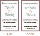
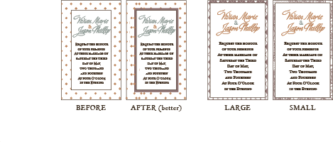
3. Borders
The print shop staff is careful to hand-trim proofs in such a way that they will reflect any cutting variance that could occur in final (machine) cutting. Sometimes it is difficult to make the issue apparent on the samples. A specific concern is frames around edges of pieces or thin lines that run parallel to the edges of a printed piece. These frames and borders can be thicker on each edge of the final prints, depending on the very slight shift of the guillotine blade (see graphic examples below of what can occur due to cutting shift). Further, a slight skew can cause the border to be thicker on one corner than on the opposite corner.
Please expect varied thicknesses around the edges when you include borders or thin lines around the edges of your prints, even if they are not very apparent on proofs. Please also be aware that a slight skew could cause a border to taper down in thickness as you follow it across the piece. You can improve results by making frames thicker and pulling in line borders further from the edges. It is imperative that you design the borders the same thickness or distance from the edges on each side in the file. This also pertains to bars across the top and bottom of a piece (either bleeding off the edge, or running parallel to the edge).
4. Color
Inserts vs. Invite Color- variance between prints is acceptable within a range across the print industry. Invitations will be mounted if they vary slightly in color throughout the stack. As they are printed in a separate run from each of your inserts, it is possible that the colors could vary slightly between your invite and corresponding inserts. Also, textweight and cardstock have different print results- the same CMYK printed on opal textweight liners or bellybands will look slightly different then the printed cardstock mats. This is important to be aware of for corresponding mats and liners. CMYK codes are Suggested codes for a close corresponding colors to C&P's papers. They vary slightly from print to print and run to run, and are not guaranteed to match the cardstock exactly. Please be aware of this so that you are not surprised when you receive your final mounted invitations. Samples will provide a close color to the final print color if you would like to preview our CMYK codes in print. This applies to custom CMYK codes as well.
5. Patterns
Any repeating pattern, either designed into custom files submitted to the print shop or pattern paper products available for order through the website could present some balance issues in a suite. Due to the unavoidable shift that is possible in cutting, there may be a slight skew that a geometric pattern can draw the eye to. For some patterns, mats that are mounted perfectly straight can still seem to look skew due to the pattern details. Also, pattern paper is custom printed to order on larger sheets that are then cut down to mats. Since there are more than one cut from the larger sheet, there is variety in the pattern throughout a stack of mats (in other words, two pieces may not be alike). Please expect variation in C&P pattern mats, panel cards, liners, and bellybands. Also, some patters are not the best choices for mats that only have thin borders around an invitation. For example, thin frames of “vertical stripes” or “dotty” patterns don't show much of the pattern and can look completely different on one edge vs. the other edge. It is better to plan on a smaller invitation that will show a larger area of pattern around the edges for patterns like these. Also, adding a mini-mat behind the invitation will help to draw the eye away from variance in the pattern background. Patterns that have finer repeating details (such as “hearts & flowers” or “tile” can look quite nice with the thinner borders.
1. Scores & Image Alignment
If you have artwork on the front of a folded card that needs to touch the score, be sure to extend the artwork past the score line in the file. We try to make sure that there is always a .5mm overlap (where your image wraps around to the back of the card). Sometimes we need to shift your image up to ensure that it touches the top of the folded card. This means that the bottom of your artwork comes up as well- so be sure that you account for this in your design by adding plenty of buffer room.
We have the capability of adding many scores to a piece if needed. Please note that our machine adds scores to only one side of a piece. In other words, all the bump sides of the scores on a piece with multiple scores will all be on the same side of the paper, and the valleys on the opposite side. A Note about Double-Sided Printing: We will try to make any adjustments necessary in scoring to be sure that the scores line up in the correct places as accurately as possible. As there is a slight variance in printing registration between the front and back of a print, the back side of a scored piece will fall however it does when we align the front. This means that the back-side artwork may not line up as nicely with the scores as the front-side artwork (or vice-versa).
2. File Setup
Safety margins between scores are as important as safety margins around the outside edges. When designing a folded piece, try to think of each panel as it’s own separate artboard.
1. Hazing
Due to the nature of laser cutting (cutting with heat), hazing around the edges of cut pieces is unavoidable. You will see the the results of the heat when you look at the edge of all of your pieces in a stack- the outside of the stack will be slightly brown/yellow. This is generally only on the outside edges, but sometimes can singe the front of the piece a bit around the surface edges. We make adjustments to achieve the cleanest result possible. Mounting a laser cut piece to darker background hides the hazing. Hazing is more prominent in designs with extremely fine details (many cuts), and on light colored papers such as white, cream, and pastels. The hazing also show up a bit more on the backs of cut pieces, which is important to know if you plan to have printing on the back side of lasered pieces. For this reason, we generally recommend not ordering double-sided laser cut pieces.
2. Intricacy
Very detailed designs can become quite delicate. It is a good idea to make your positive lines (the pieces that are not cut out) as sturdy as possible to ensure good results. This is especially important for key pieces of the design that need to hold weight. If a large portion of the design is connected with one small piece, chances are the paper will break. For example, very thin branches in a tree design can get tangled with other pieces, or become slightly bend when removing the final cut piece from the laser even with careful handling.
3. Residual Bits
We set-up each unique job in such a way that as much of the negative space is removed from the piece as possible. In other words, if a printed card has heart shapes to be lasered out, generally the pieces will be delivered to you with the hearts completely removed from the prints. In some cases with delicate/fine artwork, not all of the fragments are removed from the pieces. These residual bits can be poked out with a pin upon receipt.
4. Shift
Each lasered piece is aligned by eye. We line up prints as carefully as possible in the laser for the most accurate cut we can achieve, however, there is the possibility of up to 1/8” shift in the cut line from piece to piece. Because of this shift, it is important to review all of the details in Section “A” of the separate “press concerns” document.
5. Double-Sided
As there is a slight variance in printing registration between the front and back of a print, the back side of a lasered piece will fall however it does when we align the front. This means that the back-side artwork may not line up as nicely with the shape as the front-side artwork (or vice-versa). For this reason, we can print or laser designs that have borders or frames running along the shape line on the back of a printed/lasered piece.